
Mercury
Mercury
Company
Company
VMware
VMware
Year
Year
2023
2023

The project itself :
Mercury was a collaboration with the Army Software Factory while I was at VMware. The project focused on improving how Brigade Supply Officers (SPOs) calculate and plan material needs for training exercises, missions, and deployments—an essential process for maintaining mission readiness.
At the time, SPOs relied on a legacy system called OPLOG Planner that was slow, unreliable, and difficult to use. The application frequently froze or crashed, contained unreadable text and poorly labeled controls, and forced users through long, complex workflows just to complete basic calculations. Access to the system was also limited and restricted to specific environments.
Reduced logistics plan creation time from hours to minutes
Improved data clarity and confidence for SPOs and logisticians
Enabled faster updates and easier sharing of mission plans
Established a single source of truth for supply calculations
Recognized with a Certificate of Appreciation from the Army Software Factory
As a product designer at VMware Tanzu Labs, I partnered with the Army Software Factory as the lead product designer on Mercury, owning the end-to-end design process while also acting as a design mentor to my Army counterpart.
Low- and high-fidelity designs, mockups, and interactive prototypes
Animated walkthroughs to communicate flows and concepts
User personas, research planning, and synthesis
On-base user interviews and usability testing
Wireframing and design system contributions
Facilitating design studios and solution workshops
Competitive analysis and workflow mapping
Consulting stakeholders on UX best practices and product decisions
All about the user :

OPLOG Planner that was slow, unreliable, and difficult to use. The application frequently froze or crashed, contained unreadable text and poorly labeled controls, and forced users through long, complex workflows just to complete basic calculations.
Because of these issues, many SPOs abandoned the tool entirely and built their own logistics formulas in Microsoft Excel and other software.
Security restrictions prevented them from saving spreadsheets to shared cloud locations. Files were instead stored locally and emailed between teammates, creating confusion, version conflicts, and no clear source of truth.
Personas were selected by conducting user research and identifying common pain points, that frustrate and block the user from getting what they need from a product.

The project schematically :
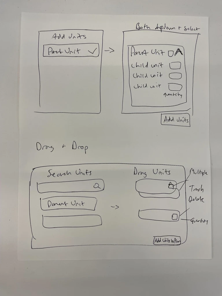
I created various diagrams and storyboards to clarify and analyze the app's information and architecture. Afterward, I sketched paper wireframes and then transitioned to digital wireframes, building a low-fidelity prototype to conduct initial usability studies with users and stakeholders.
They initially oriented on the basic structure of the homepage and highlight the intended function of each element.
Here I drew five different versions of how structure of information on a homepage might look like. Then I reviewed all the versions and combined them in the refined one.
The goal was to explore different ideas with wireframes.
More "clear" version of wireframes in a digital form. Also all the important pages are added
in it.
On this step I used the Figma design tool to create digital wireframes of all the pages. Then I bonded all of them into the clear and smooth structure.
The goal is to show how all the pages and things interact with each other.

The clear version :
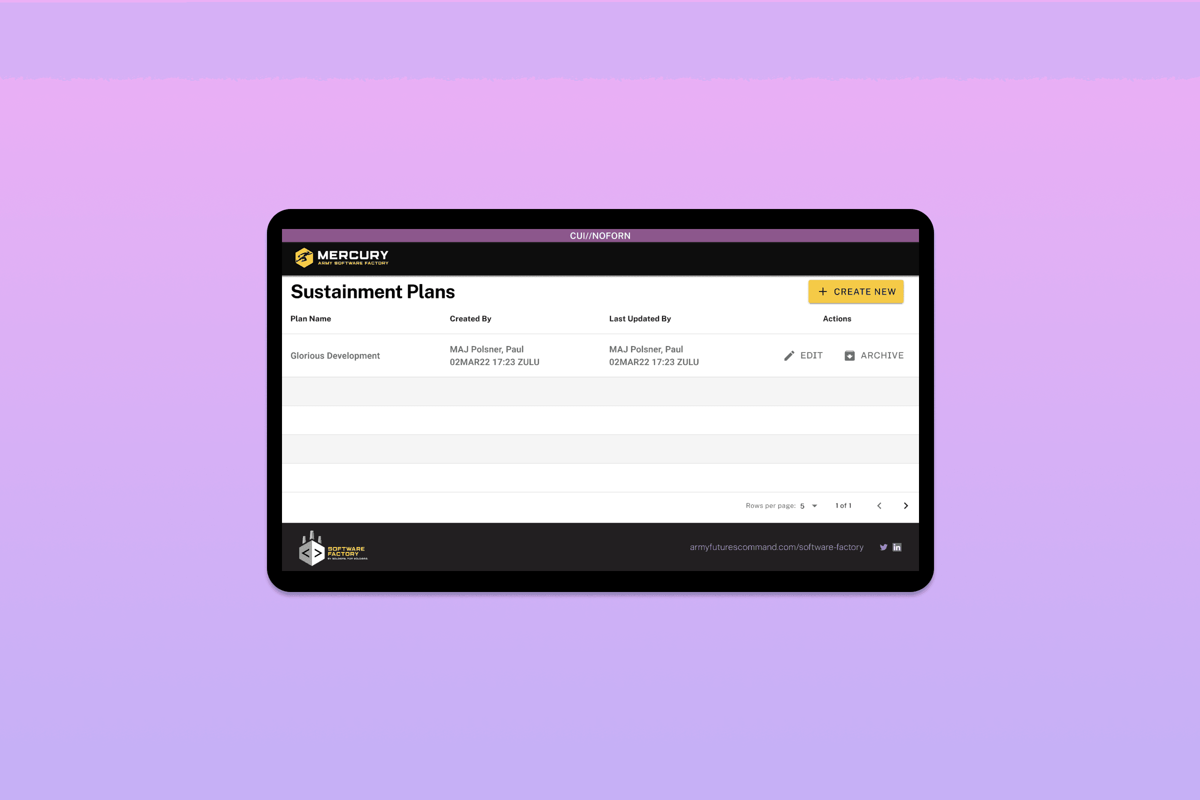
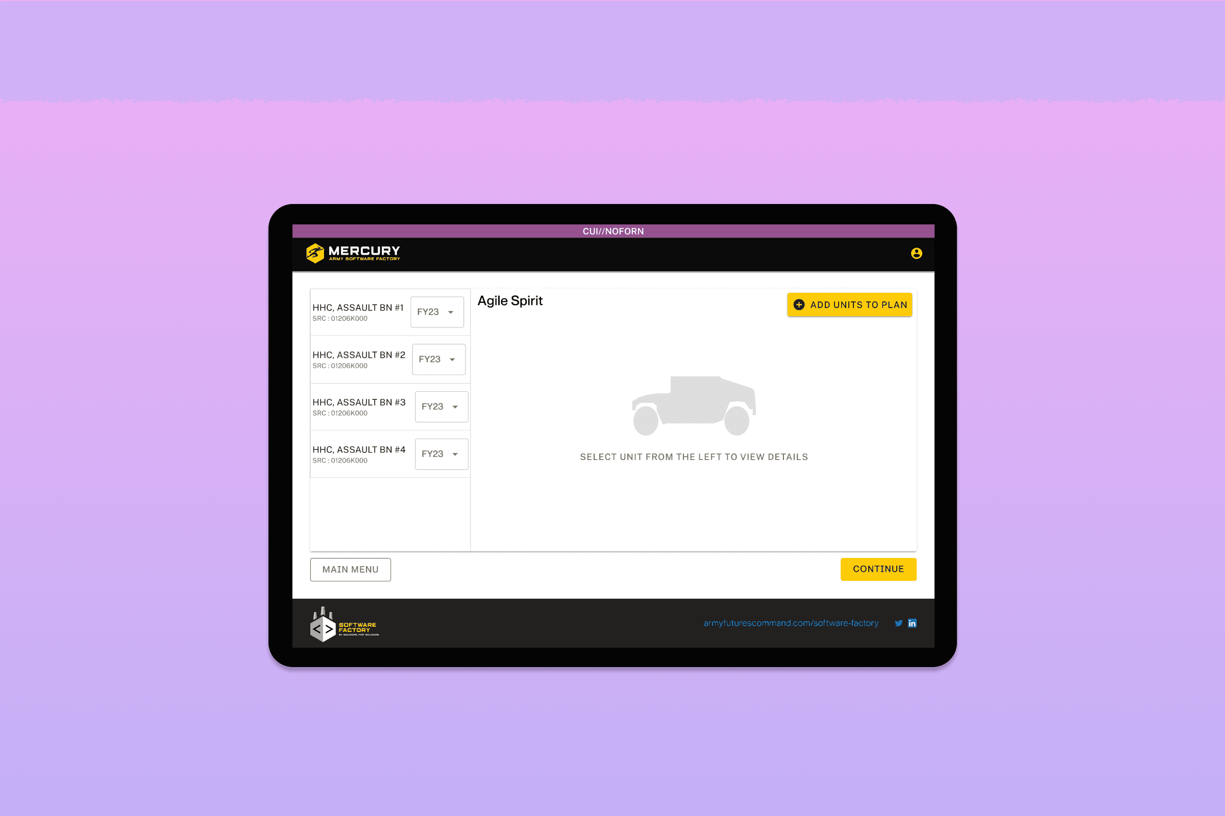
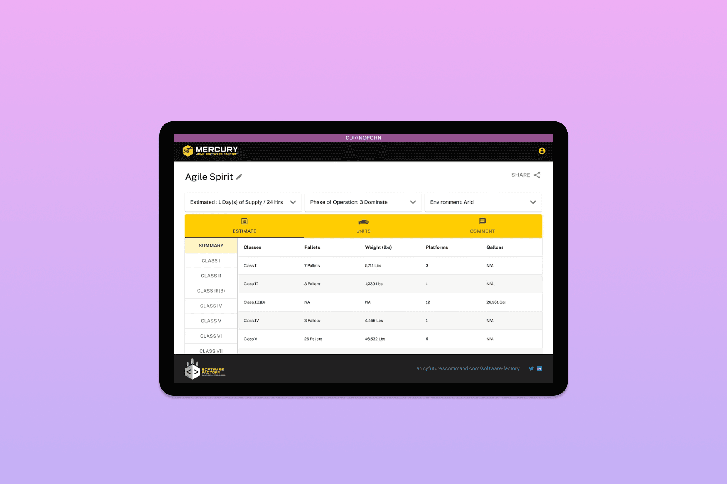
On this step, first I created a static, high-fidelity design (keeping in mind all the conclusions from the previous phase of usability studies) that is a clear representation of the final product.
After that, I created a high-fidelity prototype of the app.
These are a high fidelity design that represents a final product
I created all the app pages mockups, incorporating the right design elements such as typography, color, and iconography. I also included captivating and visually appealing images, and developed all the necessary components and elements.
The goal was to demonstrate the final Voo's app in as much detail as possible.


It's the detailed, interactive version of designs that closely match the look and feel of the final product.
I turned my mockups into a prototype that's ready for testing, using gestures and motion, which can help enrich the user experience and increase the usability of the app.

The project schematically :
Mercury launched as a secure, purpose-built logistics planning tool for Brigade Supply Officers, replacing fragile spreadsheets and an unreliable legacy system.
The new workflow allowed users to enter mission parameters, calculate required supplies, and quickly revise plans as conditions changed. Instead of maintaining disconnected spreadsheets and emailing files back and forth, teams could now collaborate on the same plan with less confusion and fewer errors.
Beyond usability gains, Mercury supported better resource planning. By improving accuracy and visibility into supply needs, the product helped reduce over-ordering and waste, contributing to more efficient use of materials and cost savings for the Army.
Both end users and government stakeholders expressed strong satisfaction with the solution, validating that a focused MVP could meaningfully improve mission readiness without unnecessary complexity.
Reduced logistics plan creation time from hours to minutes
Improved data clarity and confidence for SPOs and logisticians
Established a single source of truth for supply calculations
Received a Certificate of Appreciation from Army leadership for mentoring and design enablement